how to Arrange
 Did you know that a person is more likely to eat two pieces of cheese with holes in them but only one if it is solid?
Perception matters.
We all know that products sell better on a gorgeous site with great photographs. But even when you’ve got both, you can still be putting off or confusing your customers with the layout of your products.
When you're offering too many product choices, displaying too many pictures of your products, or arranging your products in jarring ways, you risk overwhelming your customers. You don’t want bad design to kill your sales.
Finding 1: Offering Too Many Choices
A few years ago, two marketing professors conducted a study involving jams. It’s since become a landmark. The researchers set up a tasting booth in a supermarket and offered jams to customers. On one Saturday, they offered 24 flavors. On the next Saturday, they offered 6 flavors.
What happened? The results are nuanced, so pay attention.
When 24 jams were available, 60% of the customers stopped for a taste. When 6 jams were available, 40% of the customers stopped for a taste. So it’s better to offer more options, right?
Not really. Of the 60% who tasted one of 24 jams, 3% made a purchase; of the 40% who tasted one of 6 jams, 30% made a purchase. Here’s the key takeaway: 31 people purchased jams when they had 6 options, and 4 people purchased jams when they had 24 options. That’s nearly an 8X difference.
 In other words, when you offer more products for sale, more people will visit your store, but fewer people will make a purchase. And as great as it is to get lots of visitors, your sales are what matters.
The researchers suggest that when there are too many options, customers get into a state of “choice overload, ” or “analysis paralysis.” Sometimes when choices are too great, people choose nothing at all.
If you have a lot of products, you run the risk of putting off your customers. We’re not suggesting that you should take away some of your products. You should still sell everything you want to sell. But you also don’t want to overwhelm your customers.
Here’s how to take advantage of these findings:
You will be less likely to overwhelm your customers when you have fewer products on your site. The easiest way to do that? Grouping your products and creating separate category pages for them.
When products are organized on different pages, it’s less likely for the customer to feel paralyzed by the choices.
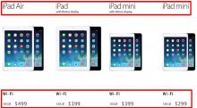
If you have various models and options for a core product, you might consider doing what Apple does for the iPad, and create an easy-to-view chart so that their differences are apparent at a glance.
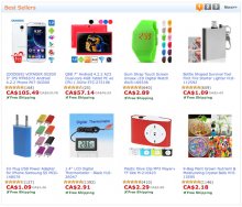
Another strategy is to limit the number of products on a page, and make your customers click to the next page so that products still seem fresh instead of overwhelming. For example, here’s what it looks like to purchase a squash racquet on Amazon.
Okay, you get the idea now. Just remember: Don’t overwhelm your customers with too many choices. Keep it simple and well-organized.
 Want to see what happens when that rule isn’t followed? Here’s what not to do:
Too much is jumbled together too randomly.
Finding 2: Strike the Right Balance With Text and Visuals
Are your customers more likely to buy your products when they’re presented visually or verbally? Visually, of course, and by an overwhelming margin.
But sometimes, for certain products, it may be in your interest to introduce more text.
, two researchers found that when people looked at products, too many pictures can overwhelm the customer, so much so that he’d put off the purchase indefinitely. When there are too many pictures, people tend to skim and skip. They simply don’t appreciate the visual variety.
The researchers find that customers tend to slow down and consider choices more carefully and thoughtfully when they’re presented in writing. Good product descriptions are more likely to make the customer wonder how he might use the product. Tests also revealed that the customer could better recall products when they’re verbally described.
More importantly, the researchers find that verbal descriptions trump visual descriptions when shoppers are looking at a lot of items. Customers tend to stop shopping when there are too many images. They slow down to read and consider when there's some text for them to pay attention to.
Unfortunately, the researchers don’t provide a magic number for when shoppers tend to reject too many visuals. That number is different across products and businesses.
Next, try to strike the right balance between text and visuals on the pages featuring all your products and on the page for each product.
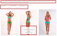
It starts with two lines introducing the personality that the swimwear is designed for. It also includes a filter based on Type, Collection, and Gender that lets you get more quickly to the swimwear that best suits you. And finally, when you mouse over a picture of the model in the swimwear, a little text pops up: The focus is on the picture, but the text is there for customers who want to click on the product page for more information.
Notice also that there are no more than three photos of swimwear at a time. That’s all you get to see. Furthermore, there are a total of only nine photos of swimwear on the entire page so you won’t have to scroll endlessly to see the total number of pieces of swimwear.
Let’s move on to the product page.
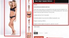
Southern Swim again strikes the right balance between a focus on pictures while providing a good amount text. Customers are able to see the product on display while reading more if they choose to.
This is an exemplary product page in many ways: We’ve highlighted the main picture (which zooms when moused over); the selection of other picture, which take the place of the main picture when clicked; the name of the product; a good amount of text; and a prominent “Add to Cart” button.
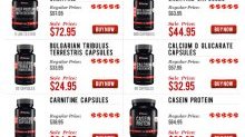
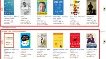
Here’s what not to do: When your products need differentiation, don’t rely on images. Use text instead. Otherwise you’ll end up like this page:

Related posts:

 Steps Determine how the living room will be used. This will help you decide what furniture to buy and what theme/color scheme to choose. Determine how many people…
 Layout for Small Rooms Strip/Basic Home Office Layout. C. Roseberry Create a Functional and Organized Workspace Tired of working in your home office because it s…
 This cozied-up formal dining room is wonderful for those who have a large family or group of friends and often find themselves throwing dinner parties or hosting…
 Take advantage of Free Shipping on best-selling mirrors, and add decorator style to your dining room and every room of the house. In small places, such as an entryway…
 Dress up a plain drum shade with ribbon. A subtle gray-blue ribbon accents the shade in this dining room, complementing the wall color. Choose a bolder hue, such…